
ProCredit Bank
Cutting a banking task down to what it actually needs to be
At a glance
- Vision / Challenge
- Redesign ProCredit Bank's mobile app to be visually aligned with the bank's brand while genuinely simplifying core banking tasks, not just restyling screens, but rethinking the processes underneath them for a diverse range of user needs.
- Impact
- Transfer flow reduced from 8+ steps to 4, validated through usability testing with real bank users before the redesign shipped.
- Key Services
- Product Strategy & Design
- Industry
- Banking / Financial Services
- Technologies/Platforms
- Mobile banking application (iOS/Android) · Hi-fi prototyping · Component library / style guide
A mobile banking redesign that cut the transfer flow from 8+ steps to 4, grounded in real usability testing, not assumptions.
When everyday banking got complicated
ProCredit came in with what sounded like a design brief: make the app look better and align it with the brand. But the deeper need was structural. The app's core banking processes, transfers, service payments, account navigation, had grown complex over time, and no visual refresh was going to fix that if the underlying flows weren't rethought. The real brief was to simplify how the app worked, and let the interface follow from that.
That meant the first strategic decision was to resist jumping straight to visual design. Before any screen was drawn, the goal was to understand exactly which processes were creating friction, for which users, and why.
The engagement was structured as a deliberate five-phase strategy: Discover, Define, Ideate, Build, Validate, precisely so that design decisions would be traceable back to real user and business needs, not assumptions.
Stakeholder interviews and a full audit of the existing app separated genuine requirements from legacy complexity, and those findings became a moodboard, an app architecture, and a product roadmap. Wireframes explored multiple structural directions before committing to one, and the chosen direction was developed into a component library, high-fidelity mockups, and a full prototype with a style guide to keep it cohesive with the bank's brand. The redesigned flows were then tested with 8 real bank users, surfacing pain points and driving refinements based on actual behavior rather than internal assumptions.
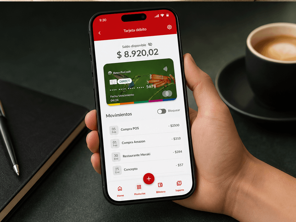
Sending money in 4 steps, not 8
The clearest example of this strategy at work was the transfer flow. Sending money, to your own account, to another bank, or paying a service, had ballooned into 8 or more steps. Rather than treating each step as fixed, the process was re-architected around what the user is actually trying to do: choose the source, choose the destination, define the amount, confirm. That reframing, defined during the Define and Ideate phases and validated in usability testing, is what allowed the flow to compress to 4 steps without losing any of the checks the bank needed.
Tested by the people who'd actually use it
- A complete app architecture and product roadmap grounded in stakeholder interviews and a real audit of the existing app, not assumptions about what users wanted.
- Core transfer and payment flows redesigned around user intent, cutting the transfer journey from 8+ steps to 4.
- A cohesive component library and style guide that let the new design stay aligned with the bank's brand across every screen.
- Direct validation with 8 bank users, closing the loop between design decisions and real usability before launch.
You may also like



Let's build your next triumph
Tell us about the challenge you're facing. We'll bring the team, the thinking, and the craft.